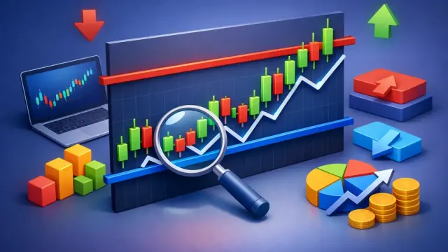
How to Analyze Chart in Forex Clearly

Most forex losses do not come from bad indicators. They come from bad reads. A trader opens a chart, sees movement, draws a few lines, and mistakes activity for structure. If you want to learn how to analyze chart in forex, the goal is not to predict every move. The goal is to read what price is doing now, define the conditions that matter, and act only when the setup is clear.
Forex chart analysis gets easier when you stop treating every candle as a signal. A chart is a decision framework. It tells you trend direction, momentum quality, nearby reaction zones, and whether the current price offers favorable risk. That is what matters.
How to analyze chart in forex without overthinking
The fastest way to improve is to use the same sequence every time. Start with market structure, then mark key levels, then evaluate momentum, then decide whether there is a valid entry. Most traders reverse that process. They look for an entry first and force the rest to fit.
Begin with a higher time frame than the one you plan to trade. If you enter on a 15-minute chart, first check the 1-hour or 4-hour chart. This gives context. If the higher time frame is making higher highs and higher lows, you are looking at an uptrend. If it is making lower highs and lower lows, you are in a downtrend. If price is moving sideways between clear boundaries, the market is ranging.
This first read changes everything. In a trend, pullbacks often matter more than breakouts. In a range, support and resistance usually carry more weight than trend-following signals. If you ignore context, even a technically correct setup can fail because it fights the broader structure.
Start with trend, not indicators
Trend is the first filter because it tells you which side has control. You do not need a complicated formula for this. Ask three direct questions. Is price making consistent directional swings? Is it trading above or below a key moving average if you use one? Are pullbacks shallow and quickly bought or sold?
A strong uptrend usually shows clean upward movement with controlled retracements. A weak uptrend may still move higher, but candles become choppy and resistance starts to cap momentum. The same logic applies in reverse for downtrends.
Indicators can help confirm trend, but they should not define it on their own. A moving average can show direction. RSI can show whether momentum is stretching. MACD can help visualize acceleration or slowdown. None of those tools should override plain price structure. If the chart shows lower highs and lower lows, calling it bullish because one indicator crossed up is a low-quality read.
This is where many beginners lose consistency. They stack tools instead of improving observation. More indicators do not always produce more clarity. Often they create delay.
Read the swing points
Swing highs and swing lows are the backbone of chart analysis. They show where buyers or sellers lost control, even if only temporarily. When a market breaks above a prior swing high and holds, that matters. When it fails below a prior low and continues down, that matters too.
These turning points help you see whether price is trending, consolidating, or transitioning. They also help define risk. If you buy in an uptrend, the most recent higher low often becomes the level that should hold. If it fails, your trade idea may be wrong.
Mark support and resistance with discipline
Support and resistance are not magic lines. They are zones where order flow has previously shifted. Think in areas, not exact price points. On forex charts, price often overshoots a level, tags liquidity, then reverses. If your analysis depends on perfect precision, you will misread normal behavior as failure.
Mark the levels where price reacted more than once, where strong moves started, or where consolidation broke decisively. Then ask what kind of level it is. Is it fresh and untested, or has price touched it multiple times? Fresh levels can be powerful. Overused levels may weaken.
A level also gains importance when it aligns with the broader structure. A pullback into support inside an uptrend is different from support inside a messy range. One offers continuation potential. The other may just be noise.
Support and resistance in live decision-making
The value of a level is not just where it sits. It is how price behaves when it gets there. If price reaches resistance with strong momentum and closes above it, that level may flip from resistance to support. If it taps support with weak candles and repeated tests, buyers may be losing control.
This is why static lines are not enough. You need the level and the reaction.
Analyze momentum before you look for an entry
Momentum tells you whether price is likely to continue cleanly or stall. You can read it directly from candle behavior. Large candles closing near their highs or lows suggest conviction. Small overlapping candles suggest hesitation. Long wicks around a level often show rejection or indecision, depending on context.
Volume can help in markets where reliable volume data exists, but in spot forex, price action usually does more of the work. Focus on speed, candle quality, and how price responds after a breakout or retest.
A common mistake is buying after a strong move simply because the chart looks active. Strong momentum is useful, but location matters. Buying directly into major resistance is different from buying after a pullback that holds above support. Same momentum, different edge.
Build the entry around risk, not excitement
Once trend, levels, and momentum are clear, then you can evaluate entry. This is where chart analysis becomes trading analysis. The best-looking chart means little if the risk is poor.
A practical forex entry usually needs three things. A directional bias, a nearby invalidation level, and enough room to the next key obstacle. If you are buying, where does the setup fail? If the stop needs to sit below a recent swing low, is the distance acceptable relative to the target? If the next resistance is too close, the trade may not be worth taking.
This is the part many traders skip because it feels less exciting than pattern spotting. But it is where discipline shows up. A setup can be technically valid and still be a bad trade if the reward does not justify the risk.
Candlestick patterns help, but only in context
Pin bars, engulfing candles, and inside bars can improve timing. They should not drive the trade by themselves. A bullish engulfing candle at random is not a setup. A bullish engulfing candle at higher-time-frame support, inside an uptrend, after a controlled pullback, is worth attention.
Patterns matter most when they appear at meaningful locations. Context gives them value.
Common chart analysis mistakes in forex
The biggest error is forcing certainty onto a chart that is not clear. Not every market is tradable right now. Some charts are too noisy. Some are between levels. Some are reacting to news and behaving erratically. Good analysis includes the ability to pass.
Another mistake is switching time frames until you find confirmation for what you already want to do. That is not analysis. That is bias hunting. Use a fixed process and a fixed set of time frames.
Traders also tend to over-mark charts. If every minor reaction becomes support or resistance, nothing stands out. Keep only the levels that clearly shaped price behavior.
Finally, many traders analyze well but execute poorly because they do not document what they saw. If you cannot explain the setup in a few sentences, it probably is not clear enough.
A faster workflow for consistent chart reviews
If you analyze multiple pairs each day, speed matters. A repeatable workflow helps you avoid random decisions and reduces analysis fatigue. One efficient sequence looks like this: identify trend on the higher time frame, mark major support and resistance, drop to the execution time frame, read momentum into the level, then check whether the trade offers clean risk-to-reward.
This is also where AI-assisted chart review can save time. Instead of manually interpreting every chart from scratch, a tool like ChartViews AI can help identify trend direction, support and resistance zones, and possible entry and exit areas from a simple chart upload. That does not replace judgment. It sharpens it. For traders who want faster reviews and more structure, that speed can make a real difference.
How to know your chart analysis is improving
Better chart analysis does not mean more trades. It usually means fewer, cleaner trades. You should start seeing the same structural patterns repeatedly. You should become less reactive around random candles and more focused on location, momentum, and risk.
A useful benchmark is simple: before entering, can you state the trend, the key level, the reason for entry, and the reason the trade would be invalid? If yes, your analysis is becoming actionable. If not, keep the trade off your screen.
The market rarely rewards urgency. It rewards clear reads and controlled execution. The more precise your process becomes, the less time you spend guessing and the more time you spend waiting for setups that actually deserve your capital.
Educational content, not financial advice. Trading involves risk of loss.
 Money Circle Blog
 Trader Reflect Blog